Day 1
History of Graffiti - The Bronx is Burning
In the 1980's and 90's, after years of political de-investment in the Bronx - from Urban Renewal campaigns, redlining districts, the removal of all firefighters from those same districts etc - Landlords began intentionally burning down buildings to sell the real estate and capitalize on insurance, with institutions like Columbia and developers with plans to gentrify beleaguered neighborhoods chomping at the bit to access the South Bronx. The displaced communities fought back in the ways they had available - they rapped and rhymed their stories into popular song form, danced on the rubble of their homes and spray painted proof of survival on the subway trains that carried the message from the Bronx to the other boroughs. Hip hop and Graffiti arose as a heartbeat and symbol of resilience - spreading to other downtrodden urban environments like Chicago and Oakland, eventually finding their way into mainstream avenues of engaging with art and the collective. Evidence of the impact of these artforms is all around us - from the most recent superbowl halftime show to fashion week runways and in popular magazines and large scale brands we see every day.
Hip Hop culture goes mainstream:
WildStyle is a typeface/way of making letterforms that originated in NYC - a clear signal in other environments where you are from, kind of like having an accent. There are styles that are distinct to other regions. We are going to design our own style of letters, unique to us - and that might tell a story about who you are. From there, we are going to explore colors, textures and shapes that further give a sense of self that speaks as loudly as your literal voice.
Step 1 - How to build your style
On a practice piece of paper (while I demo on the board):
1. Draw a simple letter
2. Use the line of that letter as a skeleton to create a similar letter shape around it
3. Add or change something about your letter shape, getting wilder or bigger - exaggerate more then you think you can or should.
Step 2 - Getting creative with texture and shape
5. Draw the letter forms around the skeleton and see how they fit into your shape - do you need more space? do the letters need to be arranged differently? Are there places where it feels nice to break out of the shape/boundary?
6. Think about some shapes and textures that feel like you - bubbly/spiky/hidden or camouflaged/easily distracted/full of energy etc - sketch some ideas you want to use in your final design
7. Sketch your design on a clean piece of paper - get as far as you can so we can add color next week!
*This part is not required, but could be really cool if you feel compelled to really get into it.
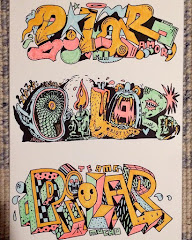
A few versions I've been playing with:
Day 2
Step 3 - Playing with color + background
Each piece needs to have:
1. At least 3 colors, not including black
2. At least 2 textures somewhere in your piece
3. EITHER your entire name OR entire background must be filled in with color and texture (or both, up to you)
There will be colored pencils and markers available to fill in either the background or the inside of your letters - test out some of your textures or shadows etc on scratch paper to make sure you like what you are planning to do. If you don't know what to add, I am going to come by and work with you/challenge you to try some things.
I am going to withhold fine line/sharpies till the second half of the session, and will hand them out when it looks like someone is ready for that as the last piece.
*Secret step (If you are feeling brave) - adding figures and symbols
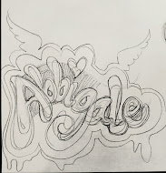
Student Work:


.jpeg)


